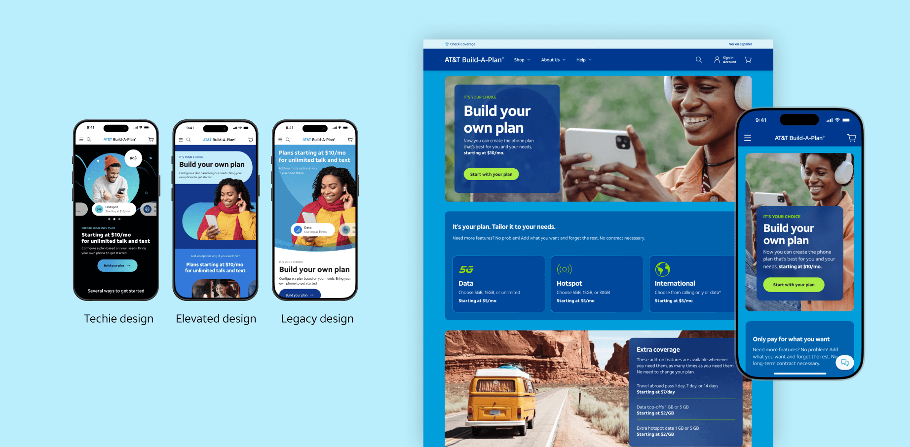
AT&T Building your own plan
AT&T is the least considered brand for price sensitive customers. By differentiating the look and feel, we built a sub brand which offers unique support and product features distinct from our postpaid services in less than 4 months directed by user feedback.
Problem
AT&T needed a new digital-only offering to attract price-sensitive, self-directed customers without relying on in-store support. Many users wanted more flexibility in choosing plan features—but none of AT&T's existing offerings addressed this directly.
Process
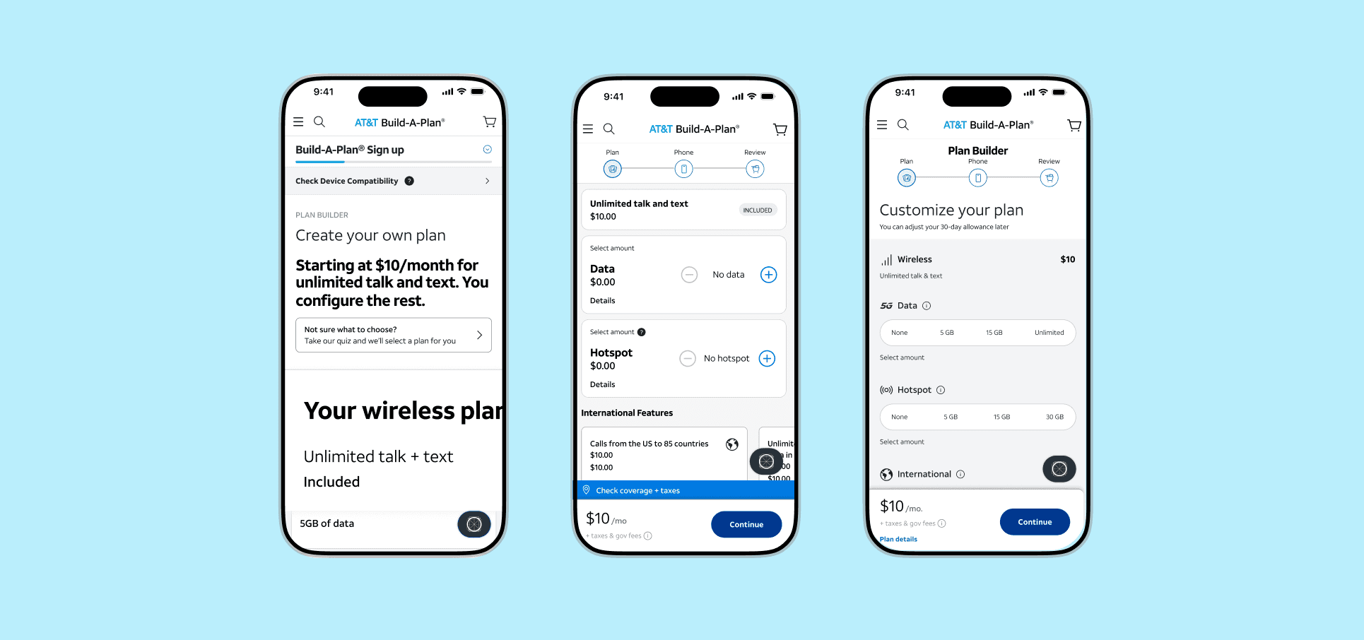
As a Senior Product Designer, I led the visual design of the end-to-end digital experience — from early flow iterations and wireframes to polished UIs and component documentation. I worked closely with product, and research teams to deliver a scalable, intuitive, and token-compliant solution.
We ran 5 rounds of costumer testing (via UserTesting.com) to validate flows, check comprehension, and refine decisions like terminology, pricing visibility, and plan toggles. These insights directly informed UI adjustments in onboarding and customization as well as the tone of voice.
Solution
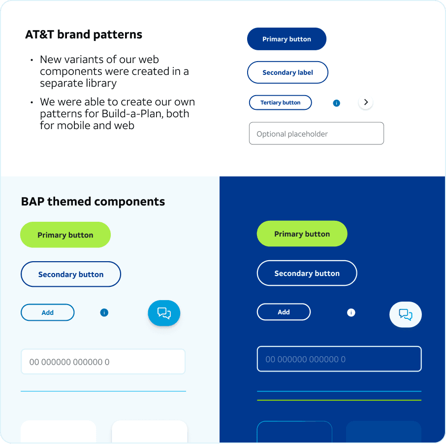
We leveraged AT&T’s official design tokens and grid system to create consistency, speed up implementation, and ensure WCAG-compliant accessibility. All components were documented and integrated with the broader BAP Figma library.
Results
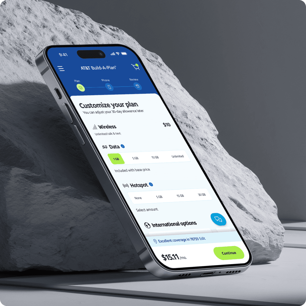
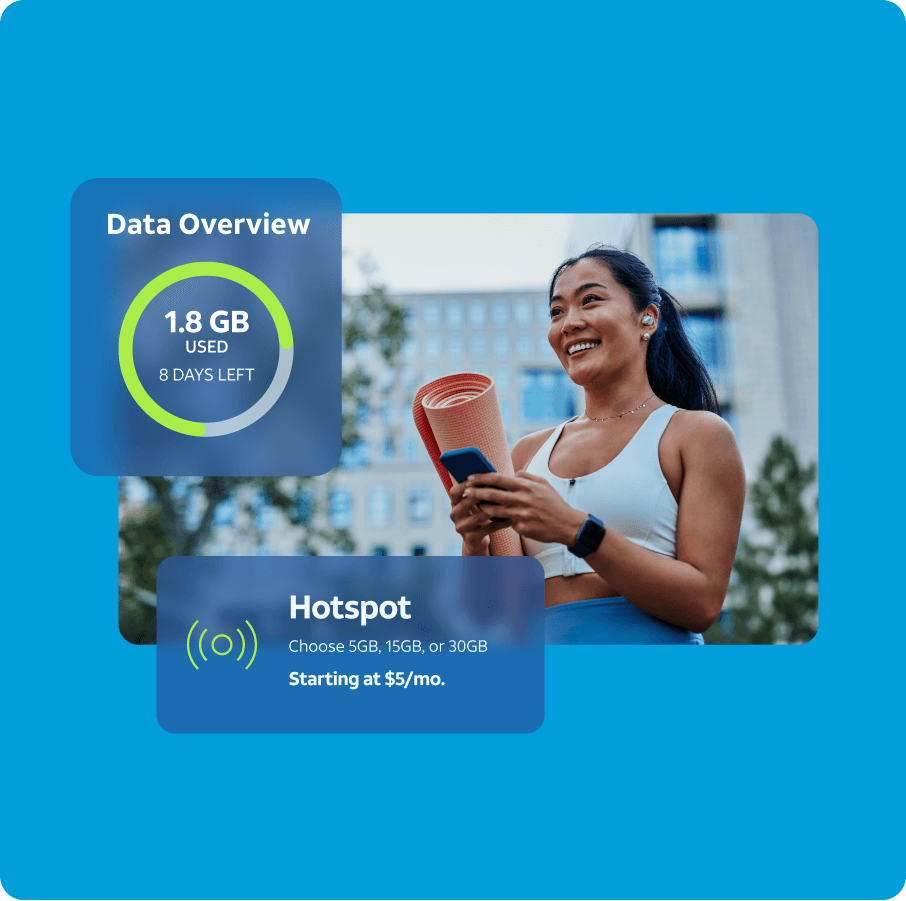
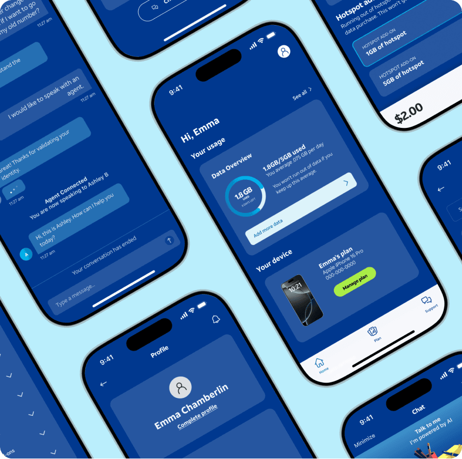
The final product is a fully self-serve wireless experience optimized for flexibility and clarity. Customers can select just what they need—and nothing more—without ever stepping into a store.
• Modular pricing doesn't have to mean complex UX
• Users respond best to transparency and visual simplicity
• Design tokens are essential when collaborating at scale
• Strategic alignment matters—especially when designing adjacent to a legacy ecosystem
Usability & more testing
Testing production-level fidelity flows will further de-risk launch. A key measure for testing will continue to be whether the design and processes are intuitive for both new and legacy users.
Feel free to reach out if you'd like a more in-depth walkthrough of this work!
View Final Prototype